2.1 Dropdown menu not accessible with swipe gestures on mobile (Positive)
2.1.1 WCAG 1.3.2 (A), 2.1.1 (A), 2.4.3 (A), 4.1.2 (A) - Mobile, iPad
The dropdown menu on the Add Benefit Details page cannot be used by assistive technology users on mobile devices. The component is designed to display a list of benefits for users to choose from once they start typing into the input field, however, not all users can complete this.
On Android devices, users are unable to interact with the drop-down options on the page with TalkBack enabled. Users can swipe to the input field (‘Benefit Name’) and type into the text box. However, they cannot access the items within the drop-down to complete this action; swiping takes them to the next input field (‘Benefit Amount’).
This behaviour is more problematic on iOS devices, where the entire component is inaccessible. When the Benefit Name form field receives focus, VoiceOver announces, “Benefit name, enter the name of… , show pop up, double tap to expand”. Double tapping, however, produces no effect. Neither the on-screen keyboard nor the listbox appears, and on swiping again, users are taken to the Benefit Amount field
Screen reader users navigate mobile sites using swipe gestures, and rely on interactive elements being keyboard accessible. However, on this page, the drop-down list cannot be swiped to. As this is a compulsory field, users would not be able to proceed without an input, which they are unable to select. This renders the page completely inaccessible for them.
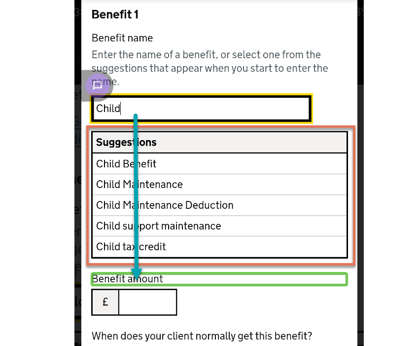
FIGURE 2.1: Dropdown menu and focus order highlighted on Android
2.1.2 Code Snippet
<div aria-expanded="true" aria-haspopup="listbox"
            aria-owns="1-type" role="combobox">
<input autocomplete="off" id="1-type" type="text" value="Child Benefit"
           aria-autocomplete="list" aria-controls="1-type-suggestions">
<ul id="1-type-suggestions" role="listbox">
    <li role="option" tabindex="-1" aria-selected="false">
      Child Maintenance
    </li>
      ...
</ul>
2.1.3 Recommendation
There are a few different issues with the implementation of this component:
An automated issue identified by Accessibility Insights: the
divwith thecomboboxrole has not been assigned anaria-controlsattribute, and instead uses anaria-owns. Implement anaria-controlsthat identifies the element that serves as a popup. It needs to reference the list of benefits (“1-type-suggestions”) that will be displayed, not the input ID of “1-type”It is unclear why the
<div>has been assigned thecomboboxrole instead of the<input>element.The
tabindex="-1"removes items from the keyboard focus order, making them inaccessible. Since focus does not appear to be shifted programmatically, users navigating with swipe gestures would not be able to reach these items.The
aria-selectedattribute needs to be removed, as outlined in Dropdown items announced as not selected on receiving focus (Medium).
We recommend updating the component according to W3C’s guidance of an editable combobox with autocomplete features, which demonstrates a combobox implemented using the above recommendations.
2.1.4 Update
The LAA team have implemented changes according to the AlphaGOV guidance on accessible comboxes with autocomplete. On Android, users can swipe into the list of suggestions and select by tapping. On iOS, users can explore by touch, and are informed of this accordingly.
This has been updated from a ‘High’ severity issue to a ‘Positive’ finding.